Analytics Dashboard
Enabling real-time usage insights for satellite imagery data
TIMELINE
PLATFORM
8 months
Web
Tags
TYPE
Data Visualization, UI Design
Enterprise B2B
Context
Tackling one of biggest pain points for Planet customers
Planet is a satellite imaging company with the world largest commercial satellite fleet in orbit, capable of scanning the surface of the Earth multiple times per day. This data is used by climate scientists and governments in identifying deforestation, tracking illegal mining, analyzing crop yield, etc and other applications.
The design work at Planet required a deep understanding of a highly technical user base and focused on championing design thinking to transform the org from an aerospace company selling images into a data company selling insights.
This project tackled one of Planet’s most significant customer pain points: the lack of visibility into data consumption. Users had no effective way to monitor their usage, often exhausting an entire month’s quota in a single day without realizing it. The existing workflow required the customer support team to manually generate Excel reports every two weeks—a slow, labor-intensive process that was unsustainable as the company scaled.
Impact
Enabled major change management by eliminating 1-4 hours of manual work per support team member, adding up to 100s of hours per month
Improved from 10% to ~95% of customers being able to self-manage quota
Unblocked major customer contract renewals
If you’d like to learn more about this case study, please get in touch!
Discovery
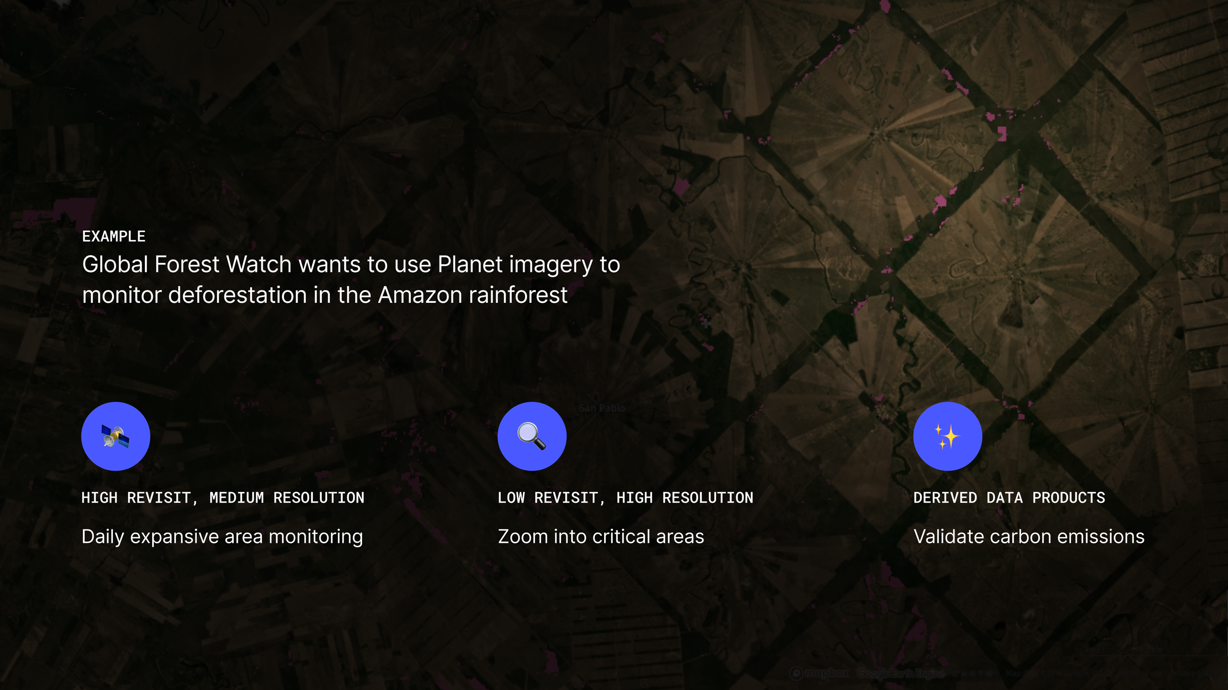
Planet provides advanced imaging products using its satellite network, offering three key product types:
Temporal: Captures images of the same location over time, enabling change detection.
Resolution: Focuses on specific areas, delivering highly detailed imagery.
Derived: Analyzes the visible light spectrum to calculate metrics such as forest canopy height or soil moisture levels.
Customers often use a combination of these products, each with unique quota metrics, units, and consumption rules (e.g., burndown, area, or compute-based spending). This variety makes it challenging to gain a clear overview of usage at a glance. Each product can have very different ways of measuring usage, I led extensive workshopping with cross functional teams to understand how we can represent everything in one dashboard.
Understanding our data product stack
Research & Audit
Iterating to accommodate multiple shapes of data
Getting a sense of the problem at hand involved extensive effort in understanding the interplay of our external and internal users and where gaps whether it be functional or technical may exist.
Audit of existing reporting capabilities
Shadowing internal users manually building reports
Customer research study understanding organizational roles around managing usage
Customer segmentation breakdown and analysis of the median number of plans per customer
Design Strategy
Building the foundation of self-service insights
When I joined the team, I reinterpreted our assigned task (which was relatively narrow) into a broader ~12 month design vision that helped engineering get a sense of a future roadmap. It’s sequenced in the following:
Visibility — Start with providing foundational level of usage visibility
Analysis — Build simple analytic tools to answer frequently asked questions
Action — Start to impact the way we sell by enabling self-service top ups
Onboarding
As a part of this project, I pushed for basic onboarding architecture around in-product guided tours, tooltips and Intercom integration to create a tighter product feedback loop
Execution
Designing for modularity and scale
The existing usage dashboard was broken, had significant layout issues and had very little usage. The first versions of Analytics Dashboard was co-created with xfn PMs to ensure consistency around how we bucket different types of data products. I spent a significant amount of time at lower fidelity to get alignment on page structure, then proceeded to add fidelity as needed. I led 2 major research studies with internal & external customers across industries and across different organization sizes. The final design is built around 3 sections: Quota Bars, Map & Reporting. Each of these pieces are meant to be independent to support a progressive launch of features. Below is a breakdown of these modules:
Quota Bars — Intended to be a ‘mission control’ UI for admins, this provides a bird’s eye view on data products across an organization. Through rounds of research, technical users preferred a higher density of data — as long as the structure was consistent.
Map View — A consolidated place for users to get a clear sense of specific geographic regions of interest.
Reporting Module — Self service reporting was key to usage transparency and keeping users on platform. We built a flexible system that enabled easy construction of custom reports, eliminating the need of hours of manual Excel work.


